![]()


- What strengths and weaknesses do you see in your own work? – Some of my strengths were taking pictures of what I thought were perfect for the assignment. A weakness was editing the picture and making it the way I want it to be. Overall I felt that this assignment helped to be at taking pictures and edit them.
2. How might you improve or refine your approach in future photography projects? – To improve I will understand how to edit faster and make sure I am doing the right moves. To approach the future of my photography projects I will take pictures that make me feel happy. I also will make sure when I edit I am doing the right thing for my project.
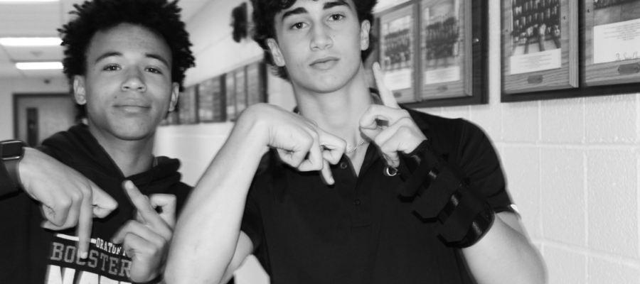
3. Pick one of your photos, what emotions or messages did you intend to convey through this photograph? – One picture is the black and white because it shows the different touches that made the picture look better. Also it was cool to have Asher and Seb be in the project and I think that made my project better. I think that message behind the picture is showing the brotherhood at OP.
4. Are there specific elements of art you would like to explore further in your photography? – I would like to learn more in how to edit but make it look real. I feel like with this type of editing it will make all pictures look cool and it can trick someone. Also having this it can make something a different color or change the size of something.
5. What concepts or techniques do you want to experiment with in your next project? – I want to explore masking because of how you can move the background but keep the thing that you want to keep. You can erase the parts that you don’t want without cutting things that you don’t need. I think with erasing it can make that picture better and you can keep your main idea in the picture.
Your color post is very good. I really like how much the color of the jug really comes out of the screen. Although, in your line picture i would have thought that would be shape instead of line. When I see that picture I see shape, rather then the tiny lines. Also, when I was looking for FILL THE FRAME, and in the blurry background I can see that one.
I really enjoyed looking at the photo of the blurred space. The major contrast of the color pink really stands out in front of all the green. I also liked the natural shape photo and how the sunlight bounces off the flowers creating a siteful photo. Next time, although you did a little bit of this, you could explore other angles when you’re taking you photos. The composition technique used in the close up photo is FILL THE FRAME because all of the space in the frame is covered with the flowers.
The color photo was great because there is definitely a clear contrast between the orange, which really pops out, and the black and white background. I also enjoyed looking at the texture photo. Your ability to get a close photo so the texture stood out was on point. Next time, however, I’d utilize the crop tool for photos like shape so it’s clear what the subject of the photo is and what you’re focusing on. The composition technique used in the photo, shape, was LEADING LINES because the line(or pathway) leads to either the ram statue or the flag.
(The last comment was for someone else).n
One photo that I liked was your texture photo, as the reflection of the light on the surface emphasizes the bumps which makes it easy to imagine what it feels like. Another photo I liked was your color photo. The black and white background makes the bright orange gatorade canister stand out even more, which is a nice touch. One photo that I think could be better is your blurry background photo because it feels more like it was a quick snapshot than fine art. In your close up photo, most of the subject FILLED THE FRAME and was very zoomed in on Zade.