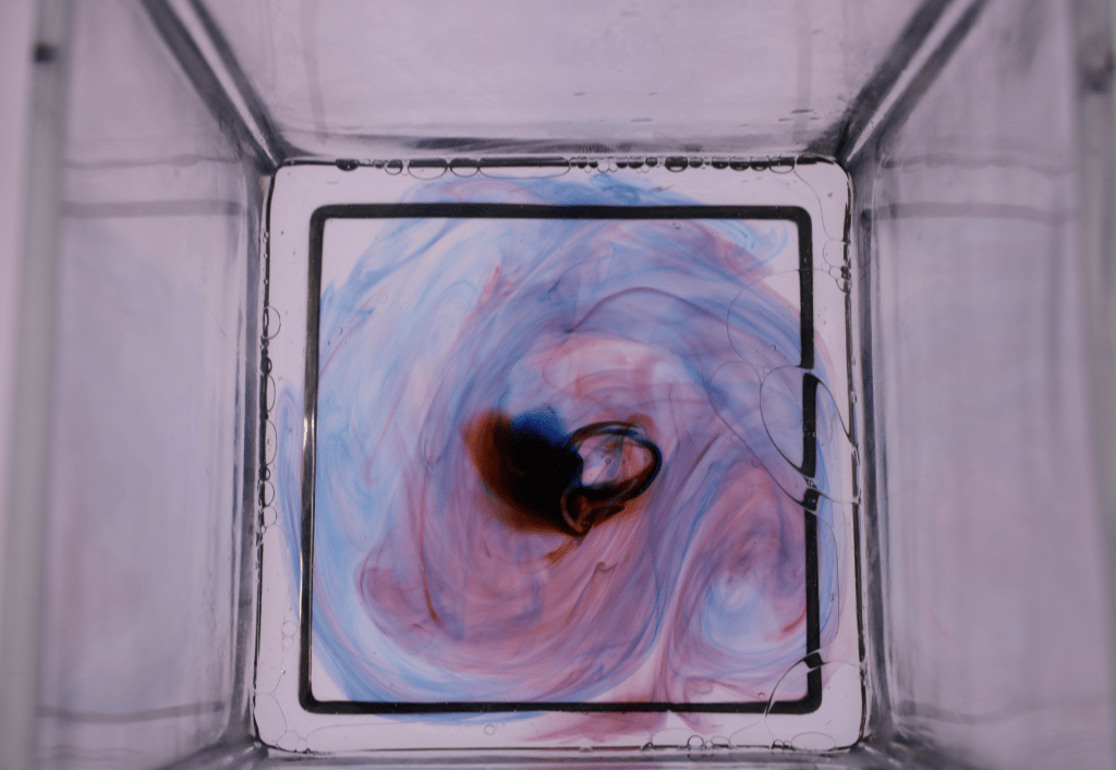
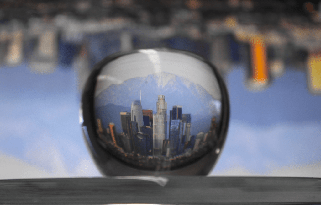
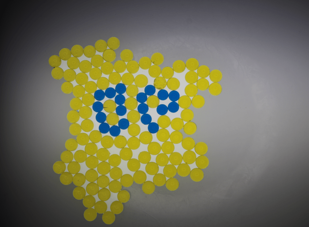
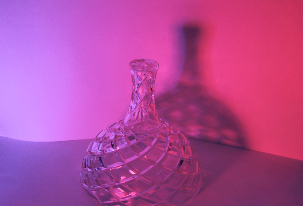
a. What is the distinct mood of the photograph? Explain. – The distinct mood of my photographs are calm because of how relax these pictures are. In the water coloring I made sure that colors moving it around the bowl. In the glass apple I made sure that the whole city line in the apple. In the water beads I used a black and white back so the beads stand out. The bottle picture I used the blue and red paper to make the bottle reflect the colors.
b. What does the photo make you think about? Explain. – I feel in the water coloring I feel calm because of how slowly the colors move. I the glass apple I feel happy to have the whole in city line in the apple. In the OP beads I feel good to have OP in the picture. For the bottle I feel cool to have a cool color and a warm color.
c. What in the photo jumps out at you? Explain. – The LA city line jumps out to me because of having the city in the background and in the apple.
d. How does the photo make you feel? Explain. – This photo makes me feel happy because I have a lot of family that live in LA and I feel happy to have part of my family in it.
e. What advice would you give to next year’s students for shooting abstract photography? Explain. – Choose anything colors that make you feel comfortable and edit to the way you feel happy.
I like the creativity of the image. The thought to include the letters OP with the school colors is very creative and interesting. I think that it was a good use of the water beads.
Something that could be better is adding more of the yellow beads. It looks almost incomplete and without a true shape to it. The beads are all over the place, except for the OP ones, and it makes the whole thing look almost like an island.
Advice I have would be to put more yellow beads in the bowl. Like I mentioned earlier it looks a bit odd with the lack of yellow beads. I would also try to either center your image or crop it better so that it fits.
Which image? Describe
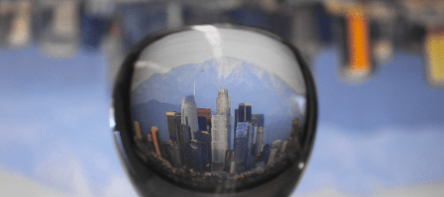
Los Angeles Apple
What do you like most about the photo? Explain writing 3 sentences in the block to the right.
I really like that this photo has the city upside down in the background. It makes it feel that the apple, and you yourself, are hanging upside down and defying gravity. Additionally, the city looks really cool in the fish-eye lens the apple provides.
What is one thing that could be better in the photo? Explain writing 3 sentences in the block to the right.
One thing that could be better in the photo is that it feels unfocused. Additionally, there is the reflection of the lights and windows in the room in the picture as well. I feel that this takes a bit away from the effect.
What one piece of advice for the photographer to help them make their work better next time? Explain writing 3 sentences in the block to the right.
I would suggest trying to focus more on the image. Additionally, as there are lights from the computer screen, I would also suggest turning off the lights in the room to prevent the reflection. To prevent the windows from reflecting, I would also suggest pulling down the shades. I feel that without these reflections, you would feel more like you are there looking at the city through the apple.
I really enjoy the shadows and faded grayness of the photo it makes it look really interesting. It also helps the colored parts of the balls pop more and make it look better. I also like how the lighting is not cented making it look more realistic.
One thing that could be better is the colored balls being more blendable into the background. It is clear that the photos intent its to make the balls pop out of the screen but this photo does this way too much. It causes the balls to look computer generated in an increablity good background causing the entire photo to look incredibly jaring. Also the background being white behind the balls makes it look even more jaring.
A big piece of advice would definitely get rid of the white background of the balls but also make them a big more blendable with the background. Perhaps make the balls less vibrant or just darker in general and the image would look a lot more natural and less like a computer throwing in extremely vibrant balls infront a realistic grayscale background.
What I like most about the picture is how clear the refraction comes out. You can truly tell that it is Los Angeles. The way the picture is photoshopped really helps the colors pop. One thing that could be better is the cropping of the photo. There’s two points of the photo that could be improved with cropping. First the top of the glass refraction, the clouds shape is uneven, which makes it seem out of place in the photo. On the bottom of the photo, there’s this black strip which takes up about a large space of the photo, and takes away what should be the true focus of the photo. One piece of advice I’d give to the photographer is to take their time when they’re in photoshop. These photos don’t have to be edited so quickly. Take a day, look at it, come back tomorrow, and look at it again. Also ask a friend what they think to ensure the photo reaches its potential.
I really like the colors in the photo, they really represent our school perfectly. I like how the photographer decided to make the picture all about OP, by representing our school in beads spelling out the letters OP. The photographer was very creative with his art, which I really enjoyed.
One thing I think could be better is making it more symmetrical. I don’t know how hard it might have been to sort the beads, because I was absent for this project. Although, I still think that the picture looks sort of messy, which is personally off putting for me, so I think it might be better to try and make the beads look more organized.
I would say that it takes more time to get the best picture. It feels like the photo is slightly rushed, with the letters not being fully aligned and the beads being all over the place. I just feel that if you take more time to take your pictures, and possibly get a few shots, you are much more likely to come out with one that you’re proud of.